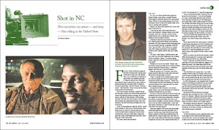
This week's feature story was about state of the North Carolina film industry. Most of the photographs featured were promotional photos from various films made in the state. However, I wanted to add in a camera to visually communicate the aspect of production.
The first photo to the left shows my final design for the first spread, showing my treatment of the camera. I used a dark green color, which tied into the themes of money, resources, and growth. The color is used on the initial cap, the headline, captions, and running header.
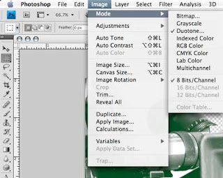
 The process of converting from a grayscale or full-color image to a monotone is quite simple. The selection is accessed under the Image/Mode menus. In print production selection of correct color mode essential to the final color fidelity of your piece.
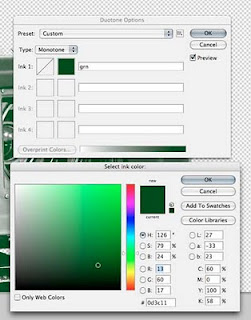
 After selecting, a dialogue box comes up with your options. Since Yes! Weekly is a 4-color process paper, I could make this a duotone without problem.
However, registration is hard to control with web offset printing (how all papers are printed), limited color will always print clearer and crisper.
To this end, I picked a green only using the cyan, yellow and black plates. Often in the paper only two colors are mixed to prevent errors with important information.
After picking the monotone color, Photoshop replaces all of the information that was formerly black with the dark green. And the image integrates better into the page layout.

No comments:
Post a Comment